The Art of Virginio Ferrari (Part 2)

Dune Acres, 1991

I will now introduce the second set of three drawings by Virginio Ferrari that I was able to acquire as a result of the quest I outlined in the last posting. These are from a series of colored charcoals that he calls “Dune Acres”, which were done in 1991, while working from Dune Acres, Indiana (on the southern shore of Lake Michigan). They are each additionally subtitled “Tre Forme”; I don’t recall whether there are other works from the same series that I saw with a different number of forms as the subject.

Virginio Ferrari - Dune Acres #1, 1991

Virginio Ferrari - Dune Acres #2, 1991

Virginio Ferrari - Dune Acres #3, 1991

The first two in this set are 29″ x 23″ (framed out to 34″ x 28″) and are drawn on vellum. The third one (not shown to proper relative scale here) is wider at 36-1/2″ x 18″ (framed out to 42″ x 23″) and is done on paper.

Unlike many of the other works on paper that I had the pleasure and the privilege of browsing through in the studio (a little more on those, below), these drawings are fully executed and polished works. The colors and the shadings, in the shapes and in the backgrounds, are expressively stroked and textured. The geometry and stance of each of the forms depict a distinct character, and the interactions between the players are dramatic and provocative and, I believe, even narrative. There are other really nice pieces from this series (done in both formats mentioned above, and perhaps others), which explore additional aspects of color, shape, and interaction.

Collective Works of Virginio Ferrari

In addition to the Gestos and Dune Acres series of drawings that I have introduced in these last two posts, I have seen a number of other different styles of drawing and paintings done by Virginio Ferrari, spanning many years and periods of his art. However, Mr. Ferrari’s primary creative output (and subject of renown) is his sculpture, so I think his most important works on paper are those that refer directly to his sculptural pieces and/or process. There are early sketches in which you can see the germination of sculptural forms, there are studies and variations on forms that have been more concretely developed, and there are completed representations of specific, readily identifiable public and private pieces. They cover the range from loose impromptu sketches to careful technical drawings that specify final (or hear-final) forms for construction and/or installation.

Many of his individual drawings or paintings work as stand-alone pieces of art, worthy of displaying and collecting. Many of them also work as part of a set of closely related items, creating an even greater impression when viewed together, or in some arrangement with one another. But the most significant way of considering his works on paper, is as a collective whole. They reflect a long and ongoing sequence and journey of viewpoint and reflection, of creation and re-creation, of experience and progression to new ideas and new expressions and new stages in a life and in a career. I have been fortunate enough to see, and spend time with, a number of Virginio Ferrari’s works, both sculptural as well as drawn/painted, assembled together (more than once, actually). Though I can’t collect all of the works, the ones that I do have are a token and a channel into a larger body of work that I admire and have long had personal connections with.

The Art of Virginio Ferrari (Part 1)

vf-header-1.jpg

This is a post I have been looking forward to writing for a while, since it covers a long(ish) personal quest to get reacquainted with—and perhaps even acquire—several works of art that captivated me at first glimpse more than twenty years ago. Along the way, I have evolved and deepened (I would like to think) my appreciation for contemporary art and artists, through a continually developing interest, exploration, conversation, thought, and perhaps just the passage of time (which means, of course, “growing up”). Here’s the story, which is also long(ish)—I’ll try and keep it manageable.

Acquaintance

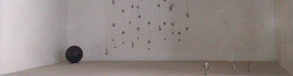
In 1990, my friend Alberto took me to his father’s studio in Chicago one night. His father is Virginio Ferrari, who is a well-known sculptor, with many public and private pieces around the world, especially around Verona (where he is from) and Chicago (where he moved to in the 1960s). As we entered the studio, even before turning on the lights, I could see shapes and figures looming and lurking—perched, posed and reposed—barely revealed by the dim ambient street light leaking through the windows. And then with the lights switched on, I could see their faces and torsos, their skin and bones, their stances and personas—of steel and aluminum and bronze—finished pieces, works in process, or some of them only ideas just starting to take shape.

I walked slowly among the pieces—some of which looked and reached outward to us and to each other, some of which sat introverted in their spaces—treading a path through constructed spaces, stoic monuments, and moments captured in time. I wasn’t able to say how much of geography and landscape of this abstracted world was purposeful and how much was perhaps chance arrangement. In either case, it seemed the authentic condensation of an artist’s perception, interpretation, and expression of the real world.

We probably spent the better part of an hour there. In addition to the maquettes and completed sculptures, there were drawings hanging high on the walls and in bins. I knew of the sculptures previously, having seen several of Mr. Ferrari’s public works around Chicago (and private works in their house), but these drawings were new to me. They represented working sketches of sculptural works and elements, but also abstract ideas and studies on form and color and texture. I was blown away. The studio made such an impression on me that I was unable to go to sleep that night. Instead I stayed up mulling and reliving the visit, and ended up writing a four-page poem called “Studio by Night”.

Reacquaintance (and new discoveries)

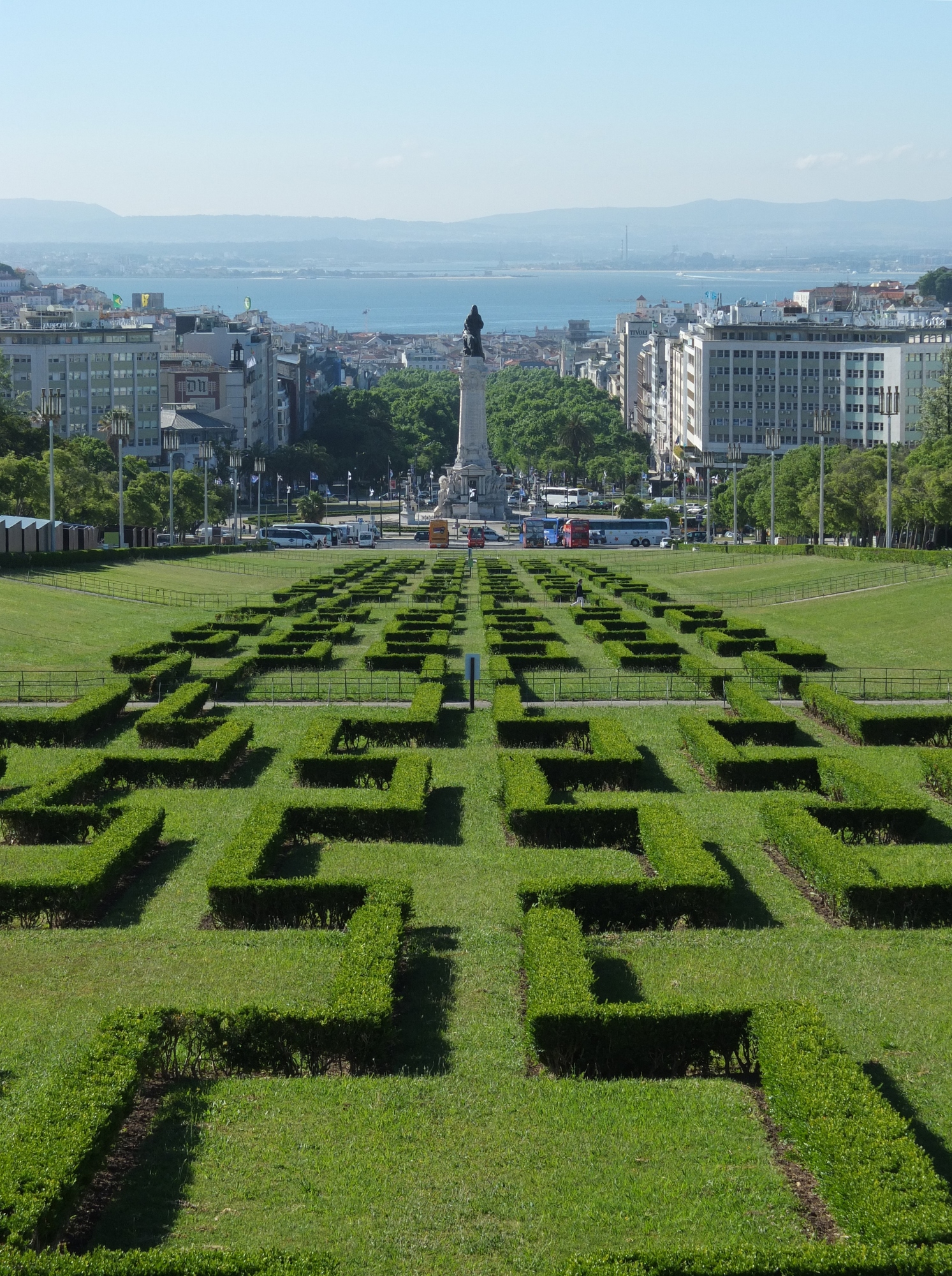
In late 1991, I moved back to California, and my interaction with my Chicago friends (shamefully, on my part) reduced to a mere trickle. As my interest in art grew, I would periodically ask Alberto to see if his father was willing to sell any of his drawings. The answer was always a little vague, until just before a visit back to Chicago in May of 2012. I asked Alberto about the drawings again, and this time he said his father would be happy to oblige. During the trip to town, Alberto and I went to the studio (along with our friend Fred), which had at that point moved to Wabash in the South Loop, to look through the drawings (as well as the sculptures, of course). It was amazing, flipping through drawer after drawer of flat files.

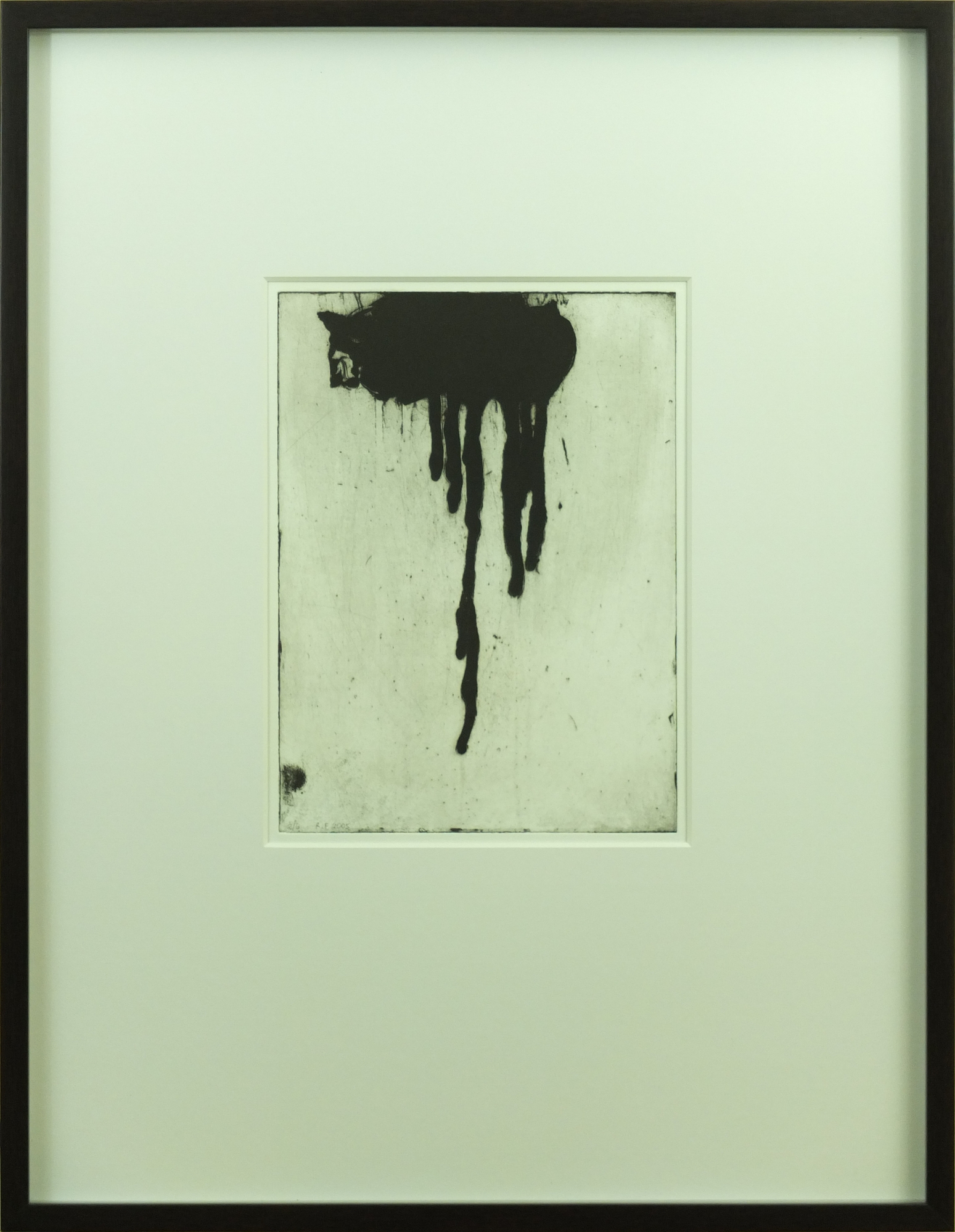
In addition to the drawings, some of which I had remembered from before, I discovered a beautiful set of prints: aquatints and etchings, in brown and black and red and green and blue. The prints were proofs of images done for an illustrated fine press edition of poems (“Mottetti”) by Eugenio Montale, published by a company called Raphael Fodde Editions. Also in one of the drawers was a copy of the book (gorgeous book), and several letters discussing the preparation and publication of the book, addressed to Virginio Ferrari, from Raphael Fodde.

As we explored the paper works, Alberto took pictures on his phone of the ones I said I was interested in. We also pulled out, separately, several drawings and several prints that particularly impressed themselves on me. There were so many fascinating ideas and themes and set of works that it was difficult to choose. It was unbelievably exciting.

Minor Interruption

The going was slow, since there were so many works, and it was worthwhile looking at every single one that we could. With many more drawers of drawings (and who knows what else) to go through, Alberto remembered that he had to feed to parking meter outside. He said Fred and I could stay and continue working through the portfolios, but we said we would come down with him. We went out and fed the meter, but when we got back to the studio, we couldn’t get back in the door. The lock had broken, and they key was not working. We had to leave, task undone. Me, disappointed, but at least gratified at having started the process. It was okay, though, since I was sure that (with Alberto’s assistance) I would be able to complete the quest, at some point.

Fulfillment

Sure enough, a year later, I was back in Chicago (what’s one year, when it’s been a twenty-year journey?), and back in the studio (moved again, this time to Bridgeport). I was able to pick out several drawings that I really wanted (six, to be exact, across two different series of works). In the process, I was able to start up a very nice conversation with Mr. Ferrari, who I had known only incidentally when I was in high school (mostly greeting in passing, when visiting Alberto at his home), but never spent any time really talking to. He was gracious enough to let me purchase the works that I selected.

The Artist

Virginio Ferrari is one of the “true artists” that I spoke of in my Words and Art posting. He is a lifelong, and full-life, explorer and philosopher and communicator through his art. His art must be able to interact with the people it is intended for, as well as with the space in which it is installed. He insists on having a hand in every construction and every installation, otherwise the art will not feel (yes, I’m saying art has feelings!!!), and be felt, in the right way.

His works are often simultaneously beautiful and enigmatic and powerful and touching. Pieces from some of his periods are strongly organic in form and character. Other works and other periods appear to be purely geometric, but to me there always seems to be an inspiration and a spirit at its core that inescapably comes from nature. The pieces always seem to represent an emotional or corporeal essence, or a lifecycle process, or a relationship between entities.

And now, finally, to the art.
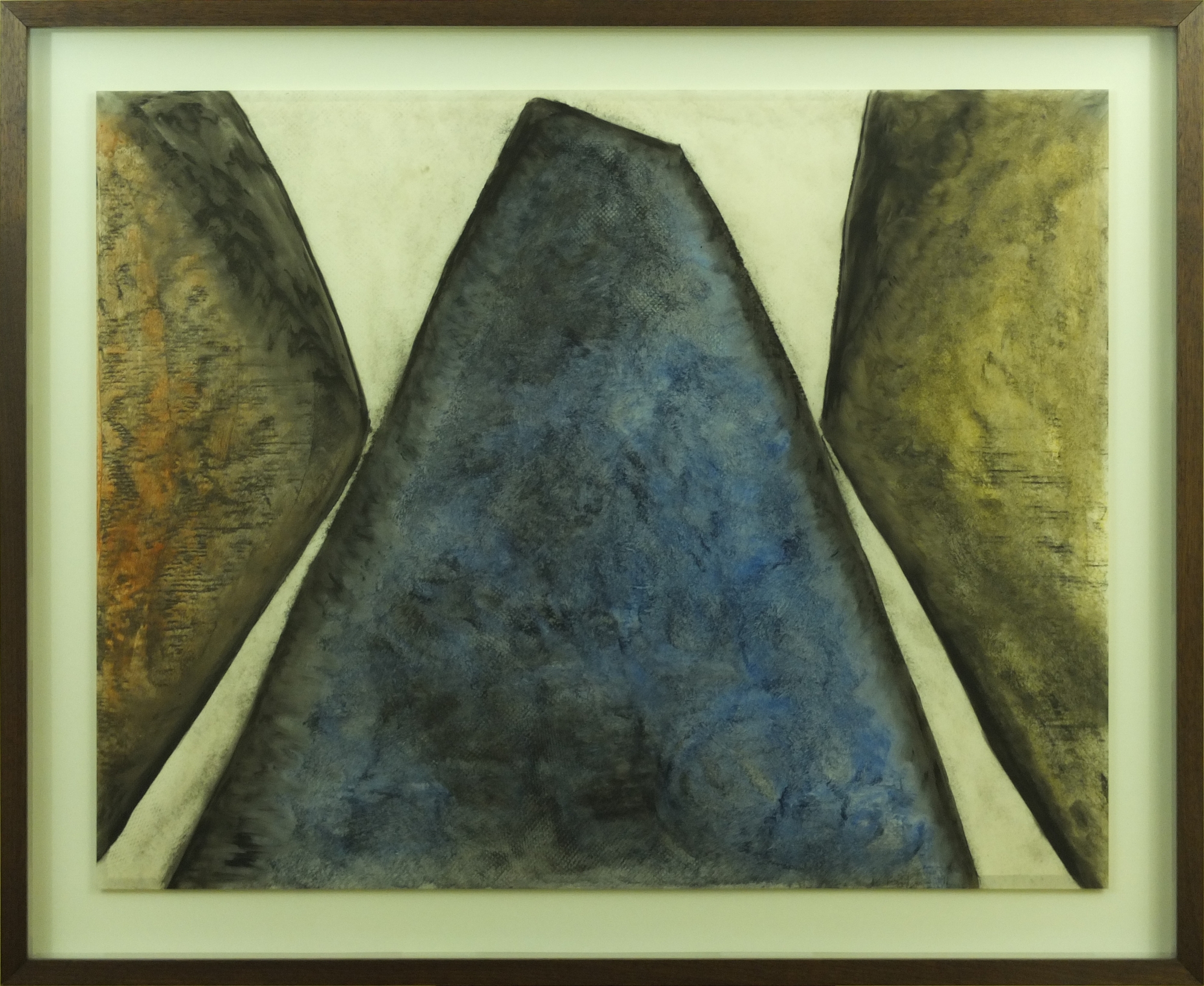
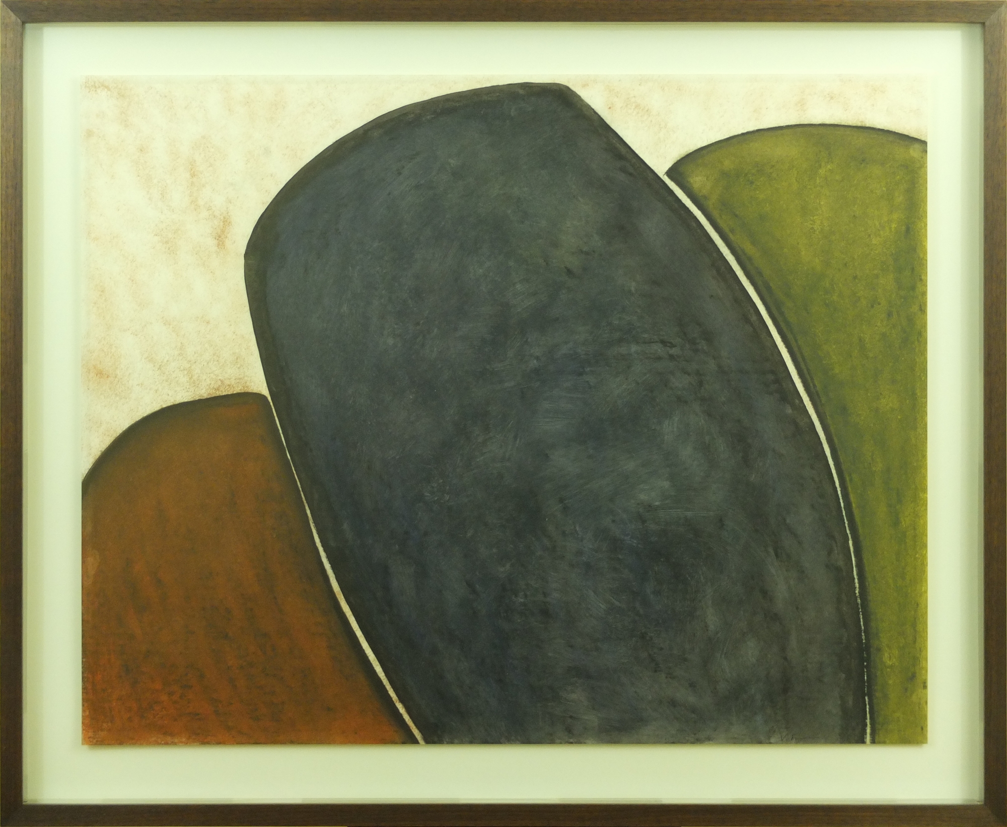
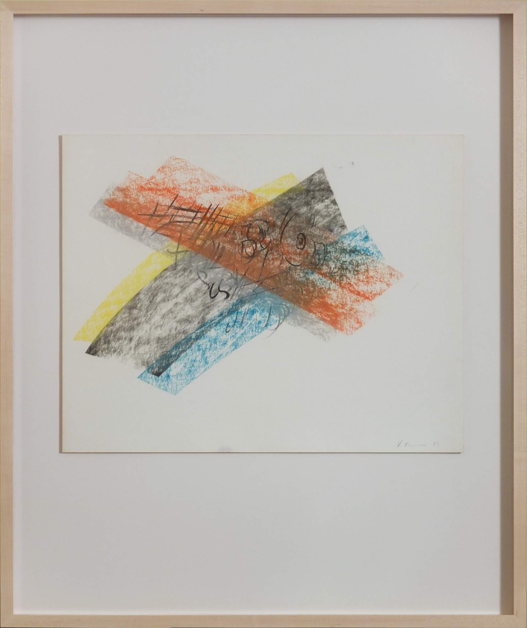
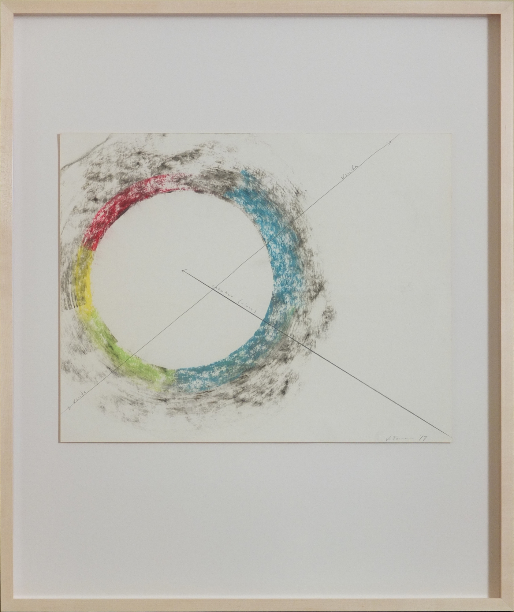
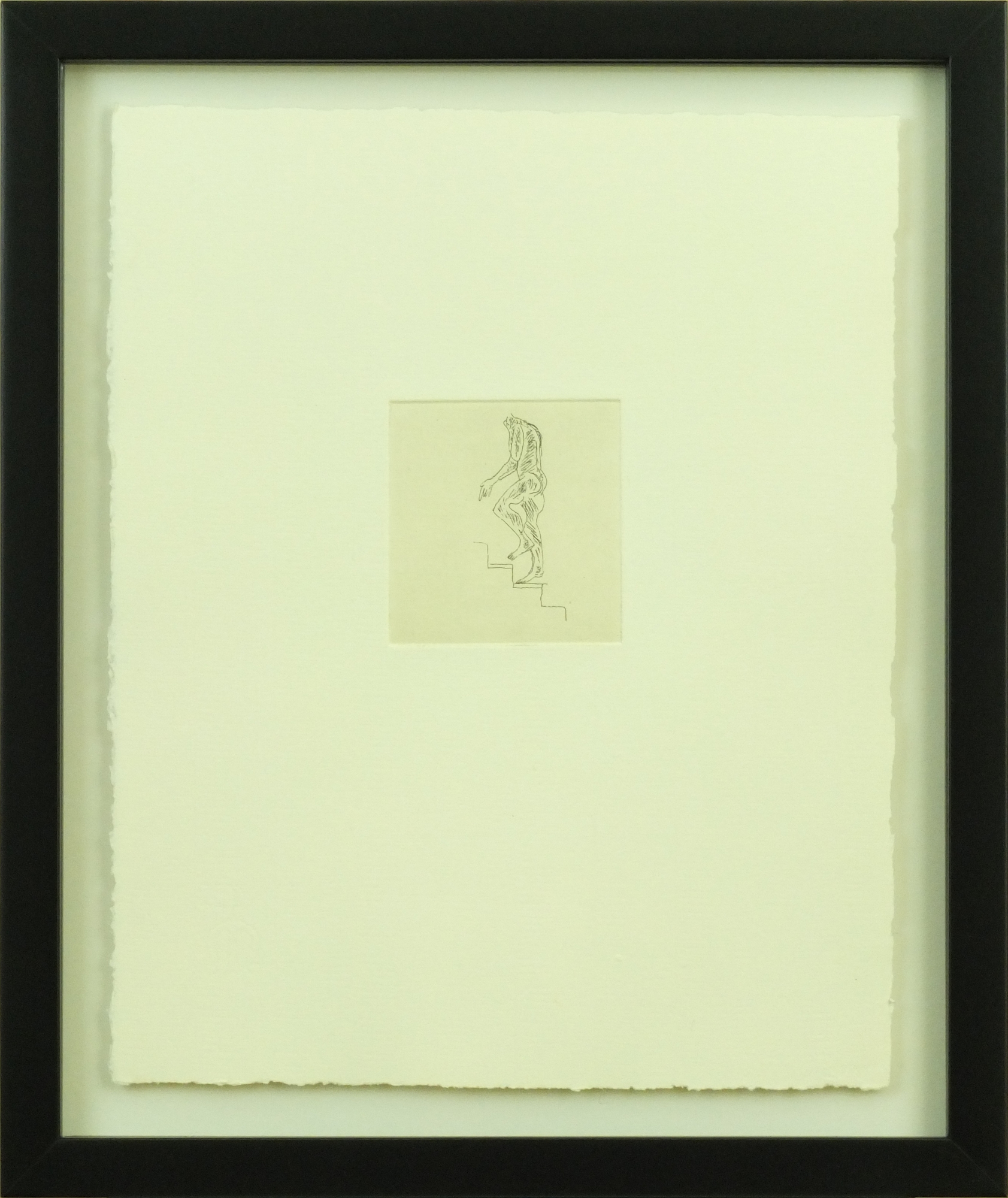
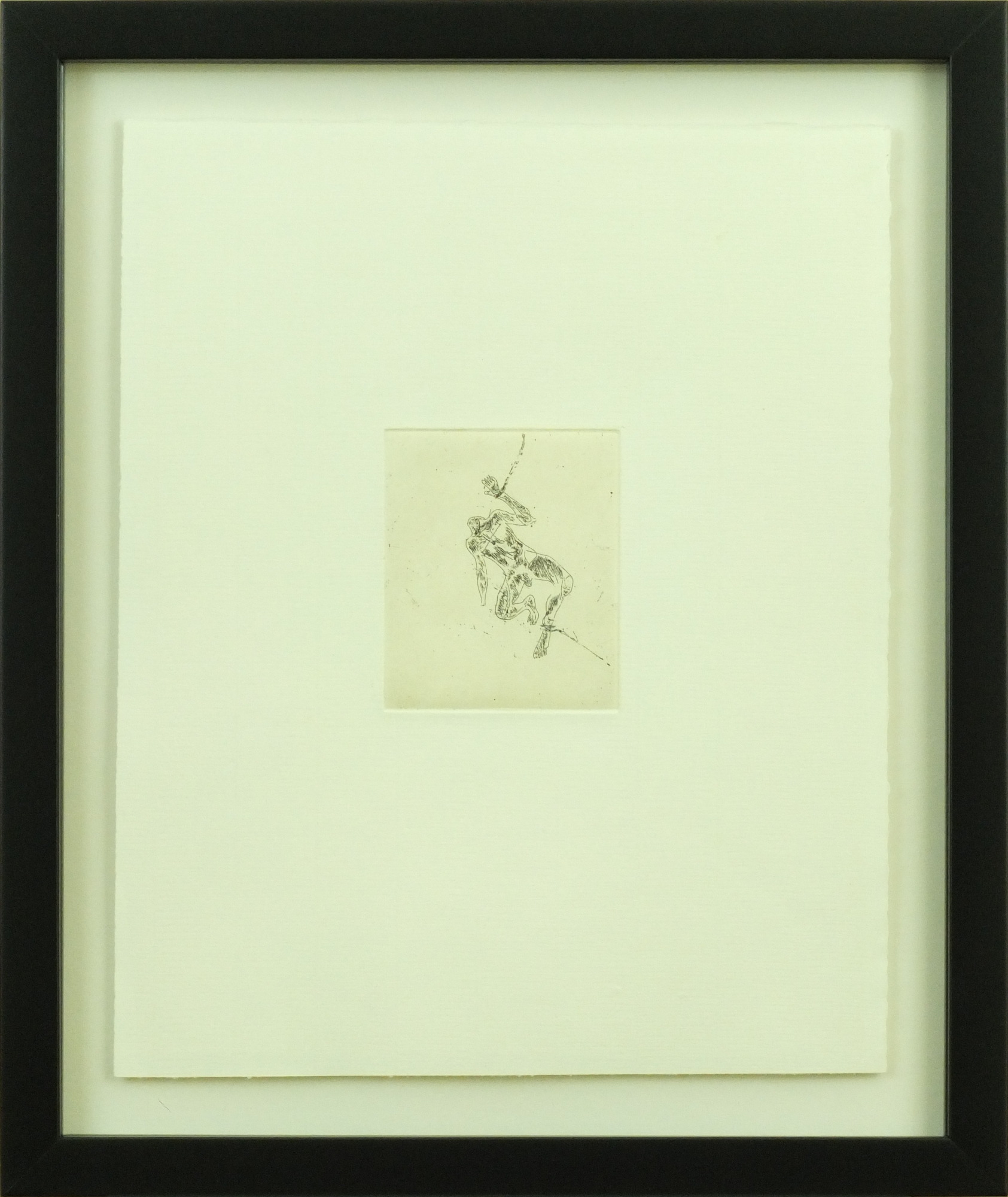
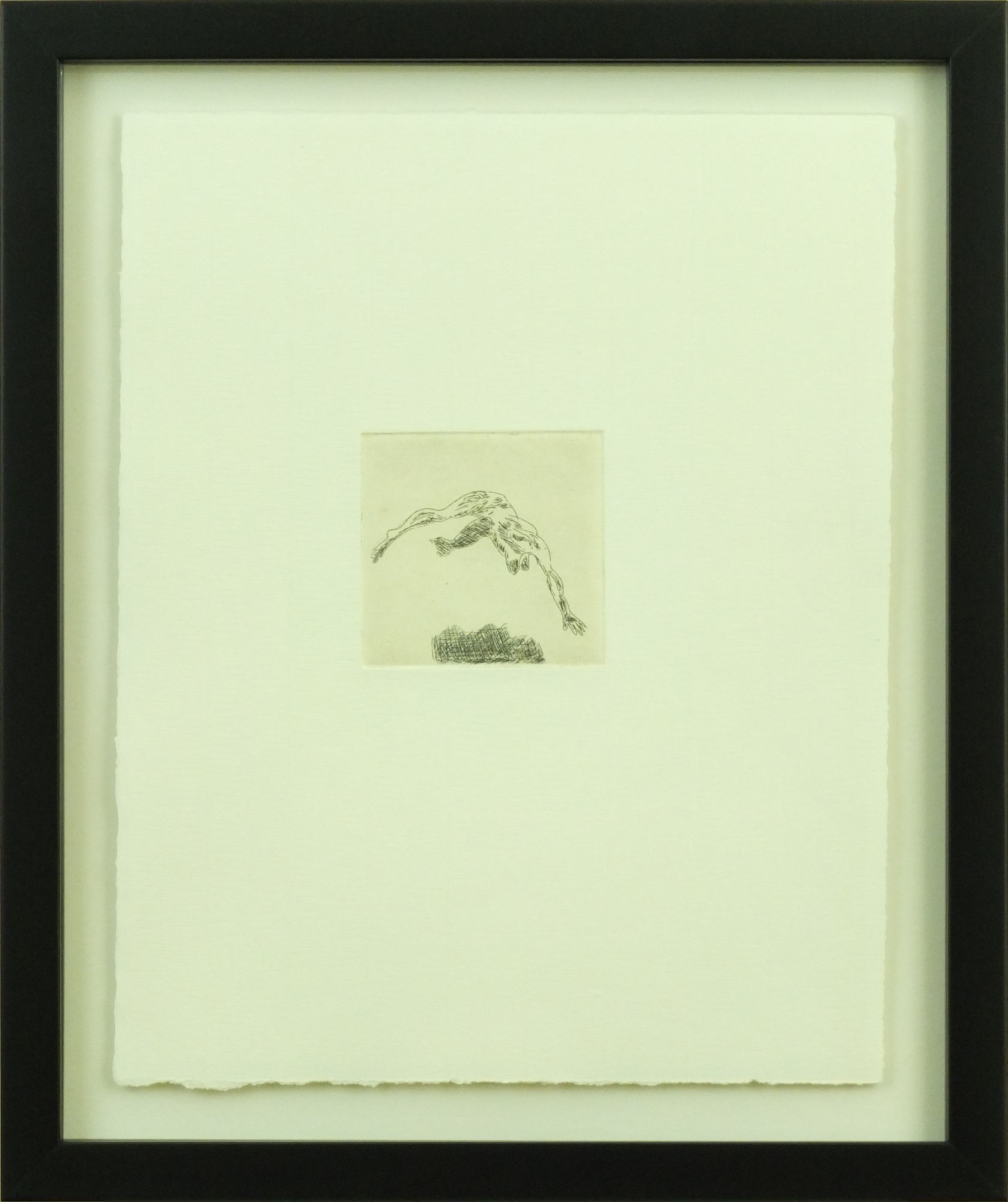
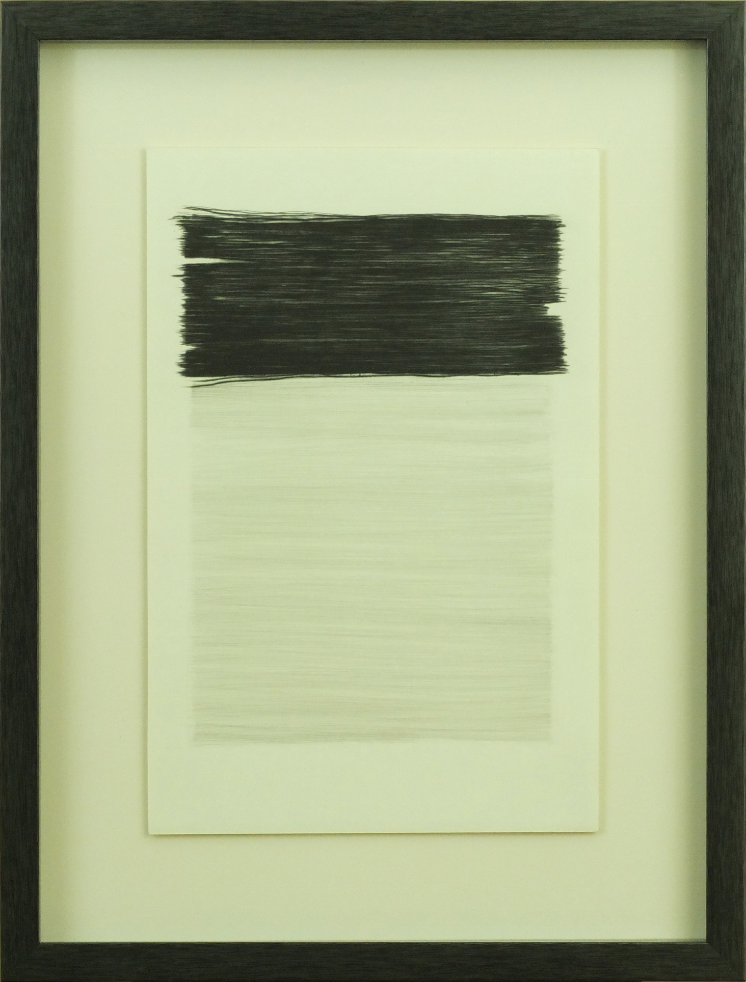
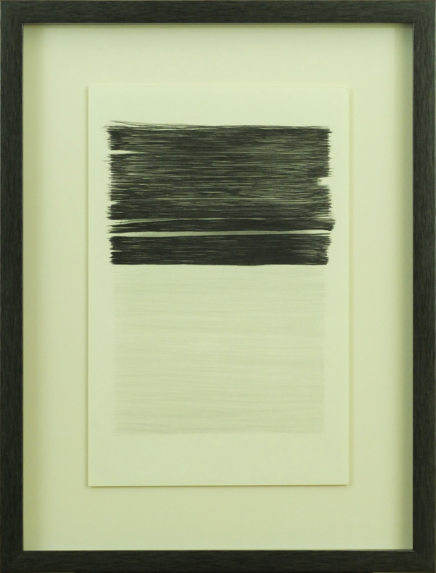
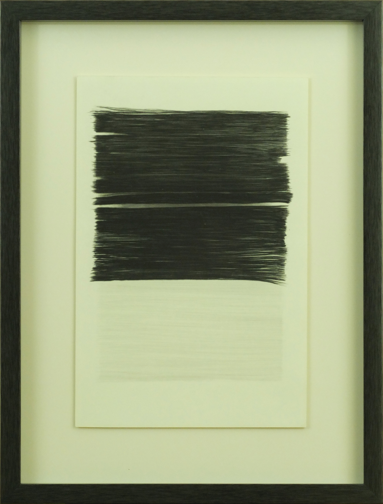
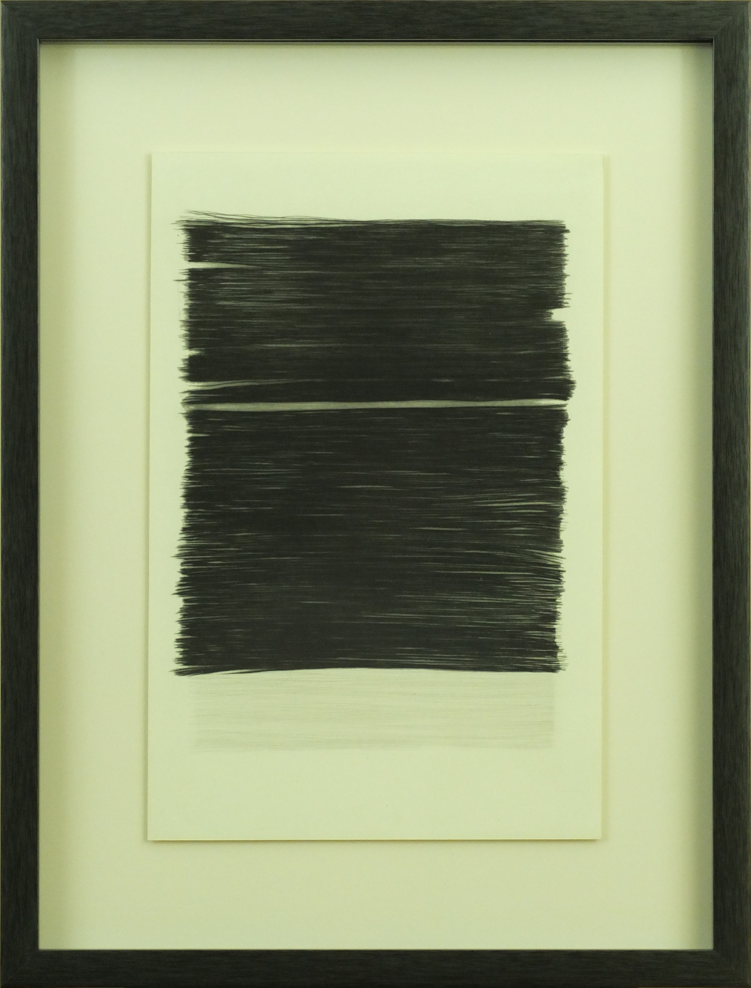
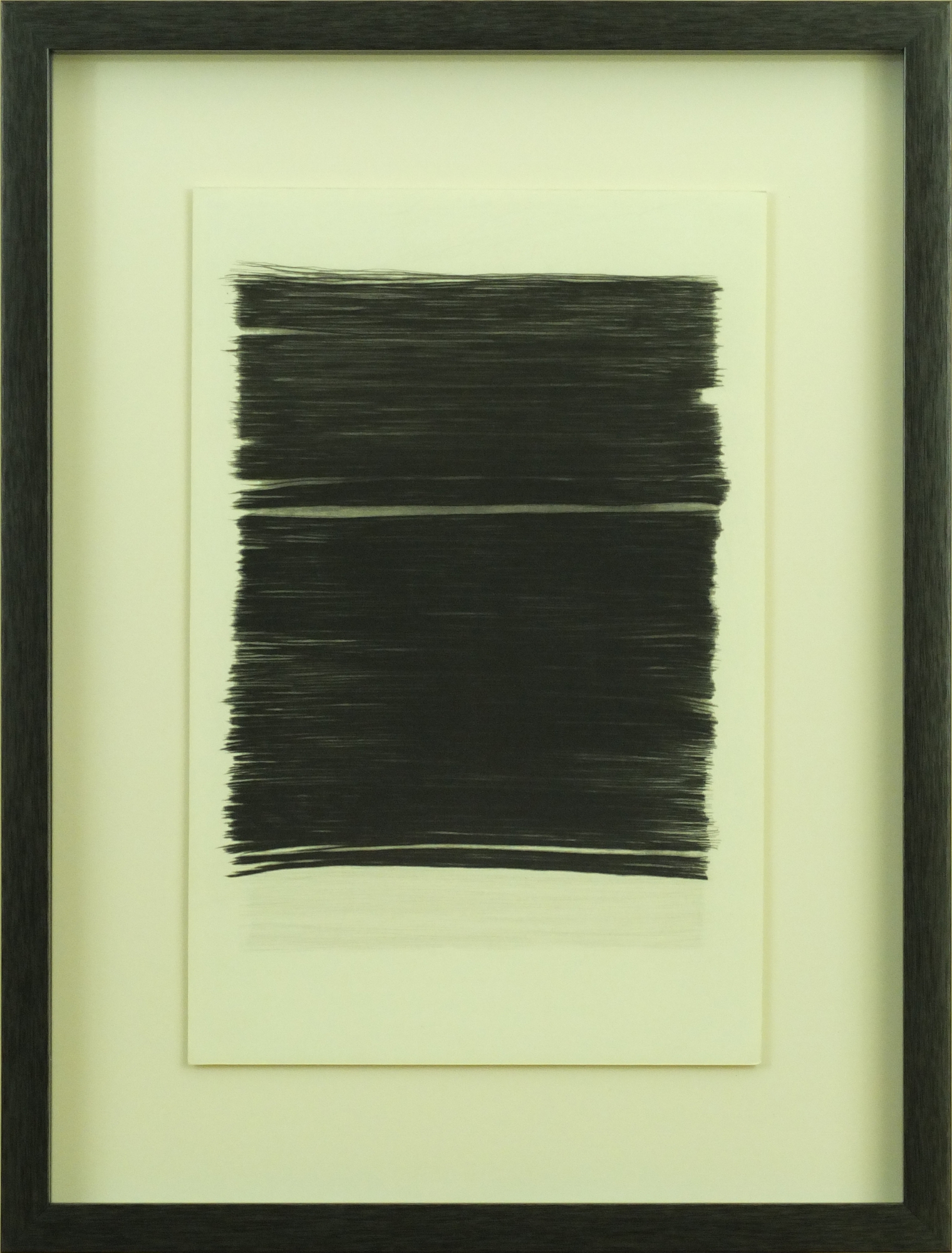
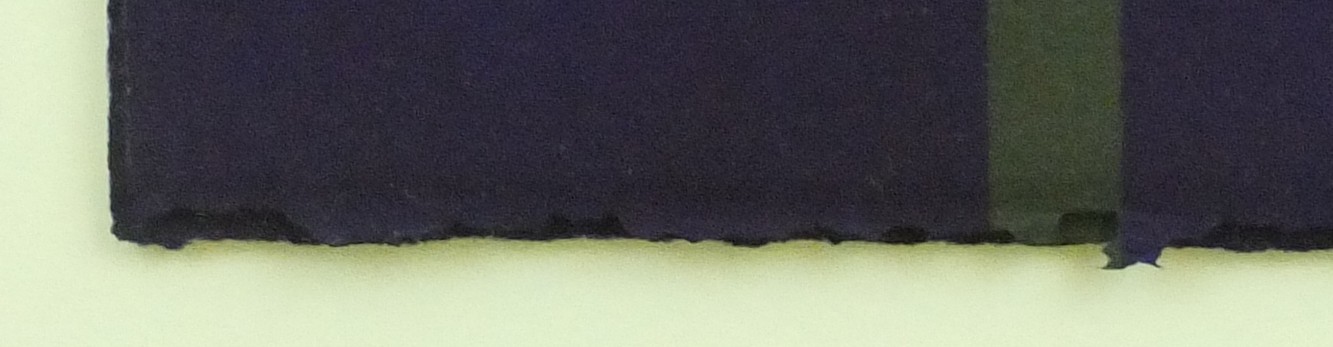
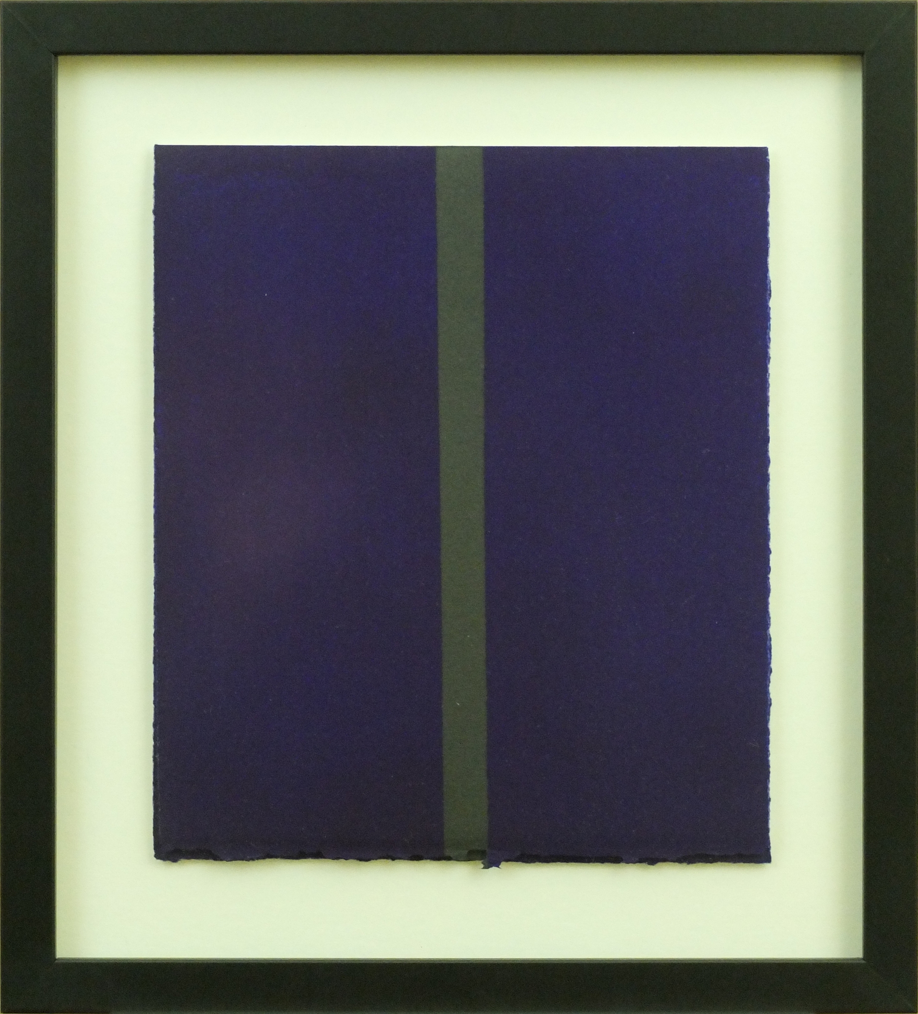
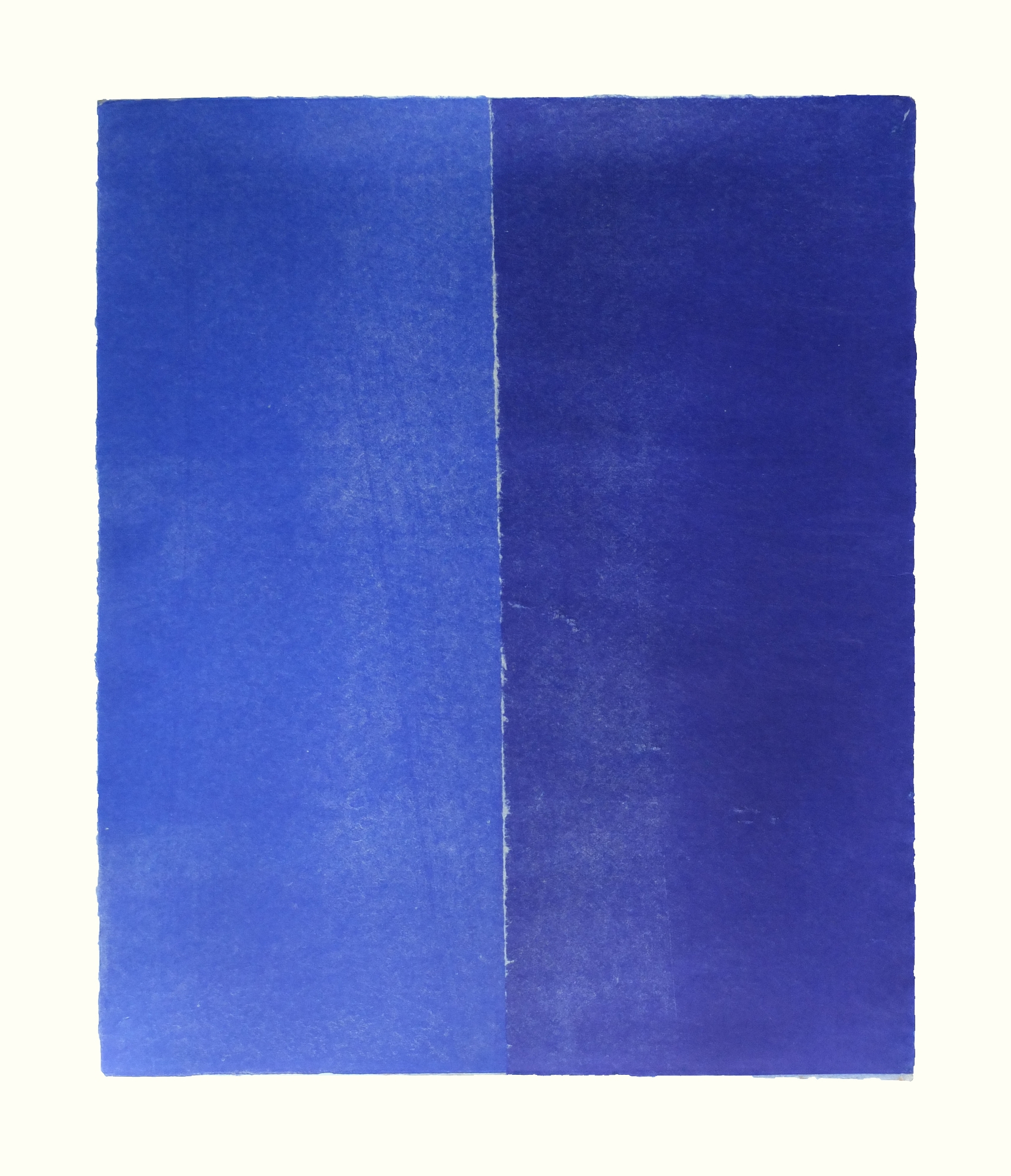
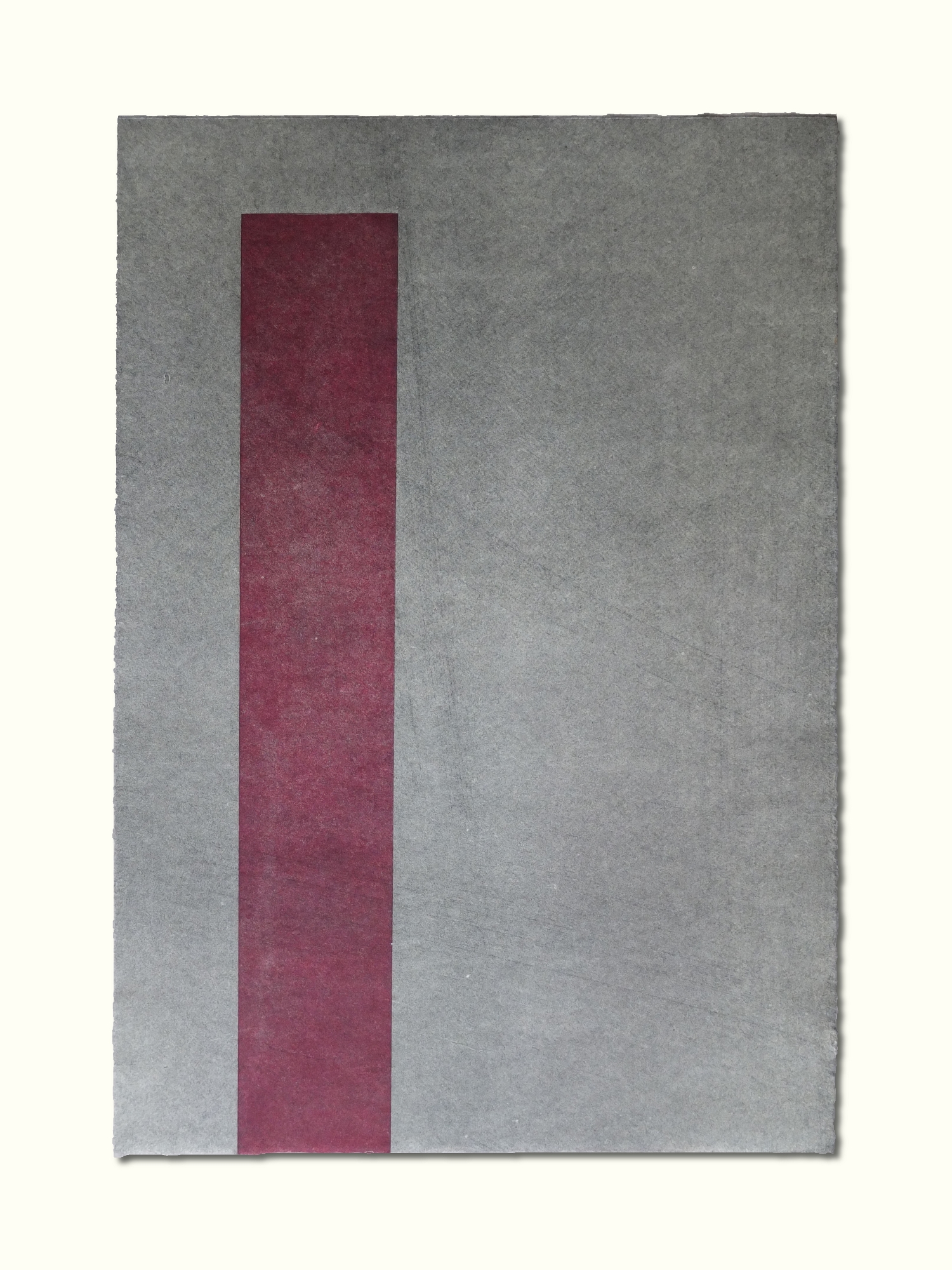
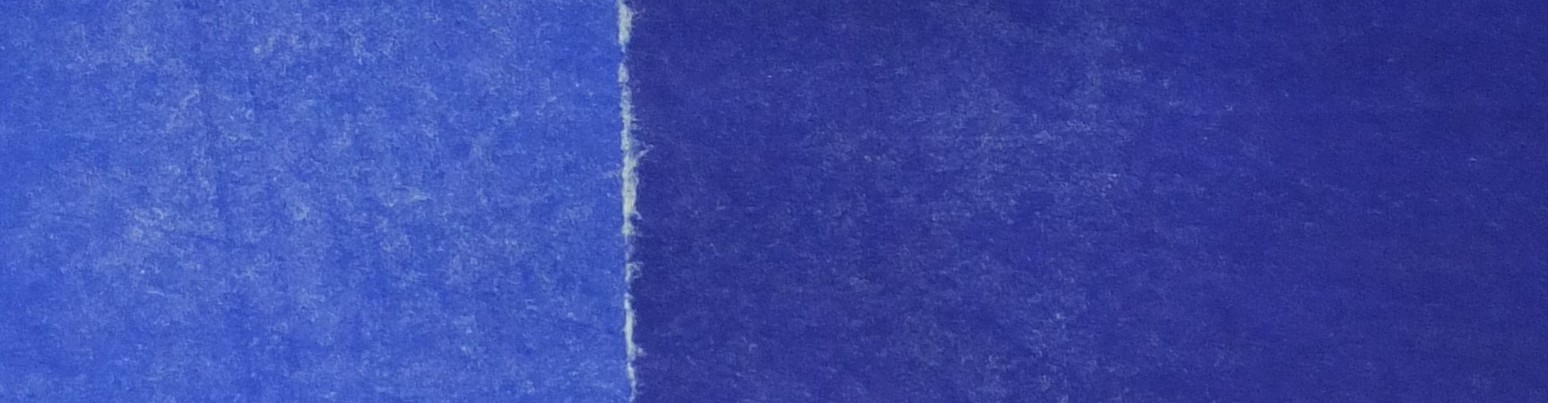
Gestos, 1977

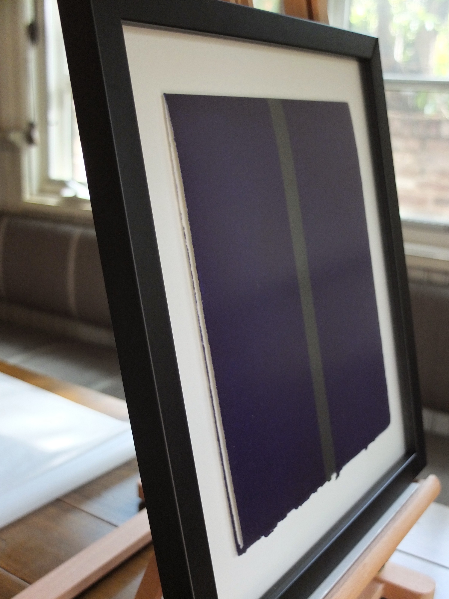
I’ll close this post by showing three of the pieces from my quest. These are from a larger series of charcoal-on-paper drawings that Mr. Ferrari calls Gestos (“gestures”, in English), done in 1977.

Gesto #1, 1977

Gesto #2, 1977

Gesto #3, 1977

These are horizontal works on paper, but I floated them in vertical frames (30” x 36”) because I wanted to hang them as a set (in my dining room). I find that these pieces have a strong tie-in with Virginio Ferrari’s sculptural work, yet I see in them new clues to some conceptions or aspects of the sculpture that are obscure, or in some cases, completely hidden (whether or not by intent).

These drawings show circular forms, as well as apparent surfaces (curved and straight) that meet, either intersecting or tangentially melding and supporting each other. Through the years, Mr. Ferrari has realized these kinds of geometries in three dimensions, on a large scale (as well as smaller scale), in metal and in stone. To me, the special insight offered by these drawings is in the textures and the colors of the forms.

The texture in the charcoal shading is coarse-grained, but reassuringly intrinsic and organic, somewhere between finely hewn veiny granite and overlapping patterns in brushed metal. It conveys an agnosticism, or perhaps an ambiguity, in the envisaged surface skin of a physical monument that would follow in the likeness of each sketch. Or maybe it indicates an artist’s sentiment that the physical piece can be effected in one of a number of materials or finishes, each with an individual and significant reason for being.

As far as I know, most of Mr. Ferrari’s sculptures during the period of the drawings are generally of a single material (metal or stone), or sometimes two contrasting materials—in either case, with the natural hues of the materials honored—monochromatic and hard. Thus, the drawings, with their polychromatic strokes, whether signifying levity or profundity, are a surprise and a revelation. They suggest to me that perhaps within the stark materials and finishes candidly exposed in the works of the period, there were also deeply imbued inner voices, and purely imaged gestures of color, for us to conceptualize and perceive on our own.

These drawings are highly expressive in their own right, but their relationship with—and enlightenment of—Virginio Ferrari’s larger body of important work, make them incredibly cherished to me.

Porto and the Rest of Portugal (Part 2)

cropped-dscf3210-1000x745.jpg

Well, we had a string of four accommodations with bad-to-nonexistent internet connectivity (last ten days of the trip), which prevented me from uploading pictures, so now I have some serious catching up to do. Picking up where we left off: getting into Porto…

In Porto we stayed at the Pousada do Porto on the Douro River, which used to be an estate house, built by an Italian architect in the eighteenth century.

DSCF3483 (2000x1495)

Here are a couple of marble details from the inside of the house that caught my eye:

At some point, the siblings in the family had a falling out, and the estate was subdivided. On the lot adjacent to the house, a cereal (meaning grain, that is, not breakfast cereal—though “Flocos Fosco” [Portuguese for “Frosted Flakes”] has a nice ring to it) factory was built, which the sibling in the estate house must have just loved. It’s the pretty pink building here (which now houses most of the guest rooms of the pousada), with the pretty smokestack in front:

DSCF3486 (2000x1495)

On the hill above the buildings, is a small garden, which is pretty nondescript except for a multi-tiered installation of roses. You can also see the pretty grain storage facility in the background.

DSCF3489 (2000x1500)

For our full day in Porto, we started with a bus tour of the old part of the city, followed by a “six bridges” cruise of the Douro River, which is the river that runs through the port wine growing region (but unfortunately, the boat turned around about 100 kilometers short of where the vineyards start). The city of Porto rises dramatically above north bank of the river, a combination of historic and majestic stone edifices, and newer whiter, rectangular buildings with red roofs stacked on top of each other in a decidedly non-rectilinear cityscape.

DSCF3342 (2000x1498)

On the south bank is the city of Vila Nova de Gaia (or just, Gaia), more sprawling and greener, with some interesting ruins and abandoned buildings along the banks to the east and west of the town itself.

One of the six bridges connecting the two sides of the river that we passed was the Ponte Dona Maria Pia (railroad bridge). See if you can guess who designed it (without going to Wikipedia, that is).

Interestingly, all of the port wine houses are actually in Gaia, and not in Porto (the namesake) itself. Our local guide was quite knowledgeable about port wine, having previously worked for Sandeman, as well as being generally immersed in the local wine culture. He actually led us himself on our tour of Graham’s, which was high in the west hills of the city, giving a detailed and excellently presented walk-through of the history and process of wine making in the region, as well as the storage/aging facility. Check out the dates on the bins in the private cellar. The tour included a tasting of a ruby (Six Grapes), a tawny, and a vintage. Fun.

We were on our own for the rest of the afternoon. Mom and I had lunch in this place (one of many) along with river on the Porto side (very nice grilled fish for me; fish soup for Mom, not as tasty as the one in Nazaré):

DSCF3426 (1494x2000)

After lunch, we walked around the old part of town. Here is my view of the Torre dos Clérigos, one of the highest points in the city (I think, or I may just be making that up, I don’t remember which). Apparently, there is an awesome view from the top, but our guide advised that we not climb the 240 stairs to see it, so we didn’t (not like Mom and I needed a super amount of convincing on that). Aw snap!

DSCF3447 (1494x2000)

It was evident that this general part of town was once an important and affluent area, with nice architectural details (iron- and stonework, and decorative tiles), but much of it seemed rundown and tired. To tell the truth, a lot of it wasn’t very pretty, but I tried to see through the grime and deterioration to a former eminence. Mom didn’t. This was not her favorite city.

After a few hours of relaxing back at the pousada, we had a nice group dinner in a private room. Here is a gratuitous, good-night (sorry about the hyphen, but what would you have me do?) shot of the smokestack on our way back to the room (in the pretty [ughh] pink building):

DSCF3194 (2000x1500)


Postscript on the language

So I had somewhat of a problem with Portuguese, the entire time in Portugal. Actually, the problem isn’t really with the language itself, it’s with me (or most Americans, I would suspect) and the language. There are two major difficulties: (1) It is too damn similar to Spanish; and (2) it is too damn dissimilar to Spanish. It is tantalizingly close to Spanish (however little or much you know) that you think you might be able to get a handle on things just by mapping a few pronunciations, articles, and word endings. But you would be wrong: the differences are substantial enough as to render any attempt at the “mapping” I just spoke of completely ineffectual in making your speech understood as Portuguese. I studied my Portuguese language guide/phrasebook in most of my spare moments the first couple of days in Lisbon, only to repeatedly make the same mistakes over and over when attempting to communicate: not pronouncing “s” as “sh” (always), not remembering the silent “e” at the end of words (always, again), not pronouncing “m” as “ng” (e.g. “bom dia” is actually spoken as “bong dia”, “sim” is “seeng”, etc.—I mean, what could be more obvious?), and not remembering that Portuguese appears to have been specifically designed to frustrate the hell out of rudimentary Spanish speakers in every other way possible. It turns out that forgoing any attempt at speaking Portuguese and just speaking bad Spanish works much better, throwing in random words or phrases of English, French, or German (or Dutch or Swahili or whatever) if/when your Spanish fails you, as needed for clarification. In other words, you should do whatever you need to so the people don’t try and interpret it as actual Portuguese. It is an ancient, mellifluous language; it just caught me off-guard in its difficulty if starting with a Spanish bias.

Gallego, Basque, and Catalan to come. Should be fun for me as well.

Porto and the Rest of Portugal (Part 1)

cropped-dscf3164-2000x15002.jpg

Of course, this is not actually the rest of Portugal from a geographical, historical, cultural, or even tourism-and-travel point of view, but simply from my perspective, covering the remainder of our short (four-and-a-half-day*) visit to the country.

After Lisbon, we stopped off at the cute little fortified town of Óbidos. It is inherently quaint and well-preserved, though completely overrun with tourists, Through the city gate, we walked down the main street, which passes by one of the two main churches and ends at the other. Our guide bought us all shots of Ginjinha (or just, Ginja), which is a sour cherry liqueur, served in chocolate cups. Very charming. Unfortunately, there are at least 20 places, practically all lined up, intermixed with cookie-cutter tacky gift shops (and also one or two nice artisan shops), and about a thousand tourists squeezing to get by you as you drink your Ginja, so the charm wears off quickly. Here are a few pictures to give you a taste of the town (if you can photoshop-out the modern-day lamps, antennas, roadways, etc. in your mind):

This little gallery includes some of the perfunctory tourist shots that I had promised to cut back on, so I will have to make it up later with even more weird, abstract, obsessively-compulsively-symmetrical, where’s-the-damn-landmark(?!?!) photos.

The next town we stopped in was Nazaré, which is a very popular beach town. But this was the off-season, so it was very empty and quiet. We first climbed to the area known as O Sitio, a high vantage point overlooking the beach (and when I say “we”, I mean: a bus and a diesel engine doing all of the actual climbing, and then us people sitting in cushy coach seating), where the legend of the Black Madonna (contributing the town’s name) was said to have transpired. Here is are several obligatory touristy shot of the church (of the legend) and the wide sandy beach below, along with some stupid pictures of a bird preening on a rock (this is a form of self-flagellation, since I don’t really like birds, unless dead on a plate, accompanied by fresh morels, and drizzled with an aromatic veal stock reduction):

Here’s one more as down payment for the next banal postcard shot I post:

DSCF3149 (2000x1500)

Mom and I had a nice lunch down in the town, after which we walked around looking at some of the buildings. There were actually some nice architectural details, though there were also formerly-nice** old buildings, with great locations right on the beach, that have been shamefully neglected and have fallen into varying states of dilapidation:

I’m actually going to have to break this topic into two parts, since the internet is kind of flaky right now and I am having trouble uploading the rest of the pictures (I’m embarrassed to say where we are, since it will show how far behind I am). So I’ll have to leave you hanging, for now, to contemplate the aptness of the title of this post.

Actually, to tide you over, you can also contemplate the symbolism behind the blue arrow in this picture of a typical windmill, taken from the bus in the countryside between Lisbon and Porto:

DSCF3110 (2000x1500)

It’s got to be there for a reason.


* How many people agree with me on the hyphenation here? Those of you who do, would be correct. [Though the comma in the previous sentence is debatable.] [As is the structure of the previous sentence.] [As is the structure of the previous sentence, as well.] [As is the general use of brackets here.] [I think I’ll stop now.]

** Though I didn’t intend for it to be this way, inordinate hyphenation seems to be a running theme in the entry today.  Sorry about that.  Maybe I’ll try for zero hyphenated adjectives (and other parts of speech) in Part 2.

Ups and Downs in Lisbon

cropped-dscf2845-2000x15001.jpg

For those interested, here is a travel update, starting with Lisbon and Portugal. This is actually my third attempt at this post; the other two going in very strange directions, with enough melodrama and blather that they were relegated to the bit bucket in the sky before coming to fruition. Here’s the Joe Friday version.

After suffering through a chaotic Gate 66 at SFO and crowded and frigid flight to EWR, Mom and I were unexpectedly upgraded for our flight to Lisbon. Very nice way to travel (reminiscent of Heaven and Earth), I wished the flight were about four hours longer in order to get in some additional sleep, but overall I’m not complaining. We were picked up, along with three other couples on our flight, by our guide Jesus and driver Carlos and transported through the city, which was just waking up, it seemed (it was 9:30 in the morning). The streets were clean and neat, and showed off their elegant and historical building facades. This is the first picture I took in Lisbon, showing the statue of the Marquês de Pombal in his eponymous plaza/roundabout, as we turned onto Avenida da Liberdade toward our hotel (we will see him again, perhaps):

DSCF2854 (1500x2000)

The hotel had a very good central location, about equidistant from the heart of the Baixa district (downtown) and the Gelbenkian Museum (more on that later). Since our rooms weren’t ready, Mom and I took a walk to the Castelo de São Jorge, up on the hill next to the Baixa district. It was getting warmer, so I took off my jacket and dangled it casually in one hand. I had my smaller camera and a little notebook in one of the zipped pockets, and their weight must have showed. I thought I felt a tug on the jacket, then another, so I jerked it forward and turned to see a somewhat scruffy-looking guy straighten up, and play as if slightly lost and trying to get his bearings. He didn’t even move away, he just stood there looking around, completely unaffected, as if nothing had happened. It was very unnerving. I actually wrote a long mournful, angry, dejected, indignant reflection/invective on good vs. evil and the human condition, in the aftermath of the incident (in one of the earlier incarnations of this post), but have since decided to discard the text and spare you the inconvenience of having to page down past it. I’ve gotten mostly past it, emotionally, and will be using it as a lesson learned for our days to come in Barcelona. It may have come as a blessing, though (hopefully) we won’t actually have to recognize it as such.

Anyway, we made it with possessions (thought not nerves) intact, and walked through the grounds, and then the structure, of the Moorish castle. Here is the view from the castle looking south across the Rio Tejo; you can see the Cristo Rei statue (the inspiration should be apparent—I’ll leave that statement ambiguous) on the Almada side:

P5070006 (2000x1486)

And here is the view looking west over the Baixa district, including the Elevador de Santa Justa (not designed by Gustav Eiffel—though we will see something designed by him later in Porto):

P5070007 (2000x1489)

To tell you the truth, I was still shaken by the pickpocket attempt and could not enjoy the stroll through the castle property or remains of the edifice, which both should have been quite interesting. My mind was on our carry-on bags, which we had left, supposedly attended by the porters (though the area was completely accessible and unsecured), in the lobby of the hotel. I didn’t want to alarm Mom, but I voiced my concern, and we ended up beelining it back to the hotel, skipping lunch, and blowing by the other sights we had wanted to see in Baixa.

We spent the rest of the afternoon in the hotel, and attended the welcome dinner for the trip that night in the hotel restaurant. We were treated to mediocre food and really poor service, but it was nice to sit down with, and start getting to know, some of our traveling companions. Everyone was upbeat and amiable, and there were interesting stories to share, so the day ended on a good note.

The next morning, after breakfast (this time, good food and really poor service), we did our compulsory bus tour of a few standard tourism sights in and around the city. Here are some correspondingly compulsory pictures of the Tower of St. Vincent, War Memorial, and the Monument to the Discoveries in the Belém section of Lisbon:

The last picture here is the view of the 25th of April Bridge (and the Cristo Rei again) from the Monument of the Discoveries site, in unfavorable light conditions. There is a somewhat humorous irony, at least for Bay Area folks, related to the builder of this bridge, which I’ll leave up to you to discover for extra credit. I apologize for the unimaginative postcard-style composition and framing for some of these pictures; I will try and keep those to a minimum from now on. Note, however, there will likely be a number of pictures that appear at first to be mundane tourist snapshots, but are really strong pronouncements of symmetry, perspective skew, or context-free zoom-in that could only come from the mind and insistence of a truly obsessive-compulsive individual. In those cases, the subjects themselves don’t really matter, but rather serve purely as artistic media for completely abstract statements.

And here are some pictures of the Jerónimos Monastery and adjoined Church of Santa Maria, just across the avenida from the monument site. I want to call your attention to the stone tiles that form the zodiac representation in the garden, shown here in the wider fountain shot as well as in closer detail. The combination of limestone and basalt used to create both localized texture, as well as figurative decoration, is typical for Lisbon in particular, and Portugal more generally. It is beautiful and distinctive, but inherently treacherous: it is, in many places, uneven (both upon installation, and even more so with time and settling, etc.); there are pervasive gaps between the tiles, enough to suck in or snap off narrow heels of any height, and thus turn ankles of any fortitude; and it is slick enough when dry (especially with wear), but will certainly be crazy-law-suit-slick when wet. Also note the ceiling construction and detail in the nave of the church; it is very similar to the Harry Potter ceiling outside of the dining hall at Christ Church College, Oxford. And lastly, I would like to point out the row of doors in the wall of the monastery cloister; these are actually entrances to confessionals (with the priest-side enclosures within the church, on the other side of the wall). Could there really be that much to confess within a monastery? Don’t answer that, I really don’t want to know.

The last place we visited that morning was the Summer Palace of the royal family, in Queluz, just outside of town. Here are pictures of some architectural and design details. The Neptune fountain in front of the main entrance is similar to (though slightly smaller than) mine at home, and the Yankee Doodle Monkey Fish fountain is like the one I will be getting to complement my awesome bat lamp, when I am able to create the right space for both of them (I’m currently having trouble finding a professional to help with the project).

That afternoon we spent at the Gulbenkian Museum, which unfortunately I don’t have time or space to properly present or discuss here (owing to, among other things, no pictures). Briefly stated, I was very impressed with the Egyptian small antiquities room, the various Persian and Caucasus rugs (especially the Caucasus dragon example), and the 16th century Iznik pottery (specifically the plates, better than any I remember from Turkey). There were some nice paintings as well.

For dinner that night, Mom and I walked to the Rua das Portas de Santo Antão, not too far from the hotel, and found a nice comfortable restaurant (even though it was rather populated with other people as well) among the mayhem of the street. We shared a plate of four sardines, and two large prawns (at $19, or 27 euros, each), along with some Vinho Verde (silent “e” at the end). We also split two desserts: a very egg-y cream custard, and a frozen cheese mouse with berries. It was quite a nice meal. I’ll write more about the food of Portugal and Spain later.

Our last stop in Lisbon, on our way out of the city the next morning, was the Eduardo VII Park, up the hill from the Marquês de Pombal Plaza. This is not really a picture of the April the 25th Monument by João Cutileiro:

DSCF3106 (1500x2000)

And this is not really a picture of the park, the Marquês de Pombal statue, the Baixa district, and the Rio Tejo beyond:

DSCF3089 (1493x2000)

They are merely expressions generated by traveling, being away from home, and spending time in Lisbon.

Okay, maybe this whole thing wasn’t so Joe Friday.

The Art of Raphael Fodde (Part 3)

cropped-paradiso-21.jpg

A few years ago, I was talking to my friend Skip about a guy at work who represented himself as an authority on cars and computing (two topics that will always get Skip’s attention). I said something like, “Todd [not his real name] told me blah blah blah [something or another about cars and/or computing]”. Skip, who has a scary-sharp wit (both finely pointed, and with dangerous cutting ability), responded, “Well, Todd is full of—[dramatic pause]…information”. Brutal! (For you kids out there, that’s like old-school for “lol” in this context, but better.)

Thus, I feel I need to make clear that I absolutely do not claim to represent any kind of authoritative knowledge or definitive interpretation of the art and artists introduced and discussed in these pages. And as I have previously said, I actually don’t actively seek that knowledge or interpretation (which collectively, can be considered the mysterious “understanding”, alluded to in the past). These are not postings about—[dramatic pause]…information; I am not full of it. Rather, these are expositions of my personal feelings and responses and ruminations on these subjects related to art. To me, that’s what art should be about.

Some people who know me would say that I do obsessive information(!!!)-hoarding on various topics. I would beg to differ (for the most part, at least). Yes, I dig deep on certain areas of interest, though it is never for the sake of filling myself with information(!!!). But a lot of the time, I just find myself within a confluence of activities and persuasions that catalyze into discoveries and insights.

After I am introduced to someone, or meet them for the first time, I don’t then immediately follow up by checking them out on social media (if you look up my Facebook page, you will find a testament to this), and I don’t call to grill their parents on how or where they were conceived or born, and what they were like growing up as kids. I try and get to know them for who they are, through the continuing interactions that our relationship is built on.

The same goes for art, and their artists. What I learn or come to believe, either actively or passively, is purely a consequence of following or just gravitating toward intellectual or aesthetic or emotional intrigues and compulsions (and for art, “intellectual” is the least important of the three). For me, there actually is no driving motivation, there is no defined objective, there is no identifiable endpoint. The quest proceeds on its own terms. Sometimes there is a rush of understanding (which could be through getting to know their siblings or childhood friends or neighbors, for instance). Sometimes the understanding stalls. Sometimes the understanding stews and develops, leading to new avenues of exploration, or upending other understandings and forcing a wide-spread reconsideration.

So, in discussing the works of Raphael Fodde (or later, other artists), I present no answers. Don’t look for them here.* Instead, I present reflections and speculations. I present some facts, but I probably also present some fallacies (so, please excuse me). I present some understandings, but I’m sure I also present some misunderstandings (a human prerogative). And there are countless things not presented here that I don’t know (just yet, in some cases), or that I don’t happen to—or care to—share.

How’s that for fine print?

Okay, onto the art.

Here are two series of prints by Raphael Fodde that I feel are truly special. In view of the sideways disclaimer above, I will say relatively little about them. Contrary to other possible presentations of the works (and to be real!), I will tell you that I believe the pictures here will not speak for themselves. They can only offer you a glimpse at several powerful and finely crafted works, which you will then have to use your contextual understanding and imagination to extend into an artistic experience and impact (until you can come see them for yourself). My purpose here is to show you additional depths of Raphael Fodde’s expressive means and printmaking skills.

The first set, entitled “The Disaster of War”, captures his reaction to the suffering caused by the recent wars in Iraq and Afghanistan. The technique is chine-collé (etching imprinted on fine tissue, which is pressed into beautiful, laid Magnani paper), and the platemarks are only three inches on each side (even mounted and framed, the works are only 11 by 13.5 inches).

disaster of war #1 (1683x2000)

disaster of war #2 (1680x2000)

disaster of war #3 (1685x2000)

disaster of war #4 (1678x2000)

This is from my email response to Raphael after seeing them upon receipt:

The war series is very moving, the figures are debased, dehumanized (faceless and headless), tortured, and utterly powerless. […] the small size is a powerful mechanism, you don’t really see the flesh and muscles and the degree of suffering until you get close, and then it hits you hard. The chine-collé is very fine and wonderful, you are a real master.

The tissue is so thin that you can see every textured detail of the handmade paper it is mounted on, and it sets the sad images on a grim pall. Three of the figures are either bound or discarded and destined for oblivion, but the figure walking up stairs is defiant, even in death. These will hang in my library (recently converted from an unused bedroom), initially in the artist’s numbered order (presented here). But I suspect that different arrangements of the images will evoke their own narratives and resulting emotions, which I may come to experience, and get to know and think about, over time.

The second set is entitled “Paradiso”, and is owned by my friend Celeste (who I thank for letting me share them here). These are drypoints printed from different states of the same plate. There is a background layer of lighter lines, over which the foreground lines are etched.** To put the works into size perspective, the sheets are just under 9 by 13.5 inches.

paradiso #1 (1520x2000)

paradiso #2 (1520x2000)

paradiso #3 (1520x2000)

paradiso #4 (1520x2000)

paradiso #5 (1520x2000)

To me, this is a very remarkable and important work. It is one set of three printed, with no other proofs in existence (or possible, anymore). One of the other sets is in the Biblioteca Sormani in Milan, and the last set is in the Metropolitan Museum of Art in New York (along with the plate). This work not remarkable and important because it is in the Met; but rather it is in the Met because it is remarkable and important.

Arranged in sequence, the prints represent the chronology of a painstaking detailed printmaking process, as well as the evolution and lifecycle of a physical entity, the plate, which can also be regarded as the “brush” for this work. But the title suggests that the prints also represent a spiritual journey through the celestial spheres of Heaven, or perhaps any spiritual journey. So when I look at the overall piece, I see these ideas superimposed and intertwined and inextricable—the passage of time, endeavor and accomplishment, exaltation and sublimation—simultaneously drawing from, and inspiring, each other. I, at once, see states of being, as well as a stream of mysteries.

Are the in-between states part of the work as well? What about the states before the first impression was made, or after the last print was made and the plate retired?

And what if the prints were to be arranged in a different order? Would that disrupt the journey, and break up the work; or would that depict a new transcendent path through the heavens? Are there an infinity of such transcendent paths?

Where is the empyrean within this work? Or is it never shown? Or not yet arrived at?

I’m sure that clues to some of the possible understandings are with the artist. I may find out more from Raphael over the course of our interactions, either by asking (if or when it feels right) or as part of the natural flow of the conversation. Or I may not. Some of the clues may be in the Metropolitan Museum, with the plate—which in all likelihood I may never get to see. But, however many or however few of these clues come my way doesn’t really matter to me. I believe that the most important understanding of this work—whichever copy, in whichever arrangement—will always be in the mind and the spirit of the beholder.


* Some would say there are no answers in art, and I might agree if I thought that that meta-question could be answered, or even addressed…ad infinitum.

** A quick note on terminology: some sticklers actively refuse to associate the term “drypoint” directly with either “etching” or “engraving”, claiming that it is a completely distinct technique. However, it is quite natural, and also relatively common, to say “drypoint etching” or “drypoint engraving technique”, since drypoint has elements of both etching and engraving (lowercase “e” in both cases). So, I accept, and even embrace, either compound description, stickler-istic definitions be damned. [The irony here is that I am such a sticker about many things, but in the case of drypoint here, and monotype vs. monoprint previously, I have specific and defensible reasons to flout the stickler party line.]

The Art of Raphael Fodde (Part 2)

cropped-monoprint-card.jpg

Before I post the next picture, I’d like to talk a little about pictures of art.  As with words about art, pictures of art are also (though differently) inadequate substitutes for actually experiencing or interacting with art—for seeing it or touching it, or even being in the same room or space as the art.  To me, it’s somewhat similar to getting to know people.  You can read stories or books about people, you can see pictures or videos of people, but you aren’t really able to connect with them or be affected by them the same way as if you meet them, and spend time with them, and look into their eyes, and laugh (or cry) with them.  I’m not saying you can’t be moved by stories about people (or art)—clearly, you can—, but perhaps in those cases you are responding to their personas and their deeds and their circumstances and their travails and their triumphs, as told to you by a skilled raconteur, rather than actually being touched by the corporeal person.

I don’t want to carry this analogy too far, since there are other ways to interact with people, and get to know them, and build genuine and powerful relationships (e.g. through letters, phone calls, email, [gulp] social media, etc.) that don’t apply to art (at least, not yet), but you get my drift.  The point I’m trying to make is that any pictures of art that I share here are absolutely not the art itself, but just references to it.  They are visual descriptions that complement the words I write in an attempt to convey my personal thoughts and feelings about my experiences with art.  In no way can the pictures properly stand-in for, or truly express, the real essence—the being—of the art itself.  And yes, works of art are beings.  They are created, they live and undergo an individual journey, and they will eventually die.  But, their having existed, and their having had the power to relate and to influence and to inspire, cannot be taken away.

A further disclaimer: while I will try my best to post decent pictures of the works of art in my possession, the photographic quality will certainly be variable, due to limitations of equipment, skill, opportunity, and patience.  I apologize up-front, especially to the artists, for representations here that don’t fully serve the dignity of the works.

Here is a set of works by Raphael Fodde that represent a different type of printmaking than I showed in the last posting.  He calls these monoprints, though I think some sticklers would insist on calling them monotypes, since there are no permanent/reusable, distinctive features in the plate (as far as I can tell).  I’m going to get technical for a second here.  To me, a monotype is a form of monoprint, in which the “features” in the plate are the inherent or incidental textures and marks.  Or, to put it another way, the “feature” is basically just a big flat surface.  Many in the art world will say this definition is plain wrong, but that is the taxonomy I am going with here (and history may be on my side, since the two terms have often been used interchangeably in the past).

These are the works that Raphael describes as suggesting nothing but “abstraction, serenity, solitude, prayer”.  The first one is a folding card, printed on very nice art stock.

monoprint card (1812x2000)

A side view shows the true nature of the work: a “sculpture-object”, as Raphael called it in an email comment, upon seeing this picture of the framing with the card slightly ajar.

DSCF0894 (1500x2000)

The frame guards the personal message inside, though it also teases by offering a scant glimpse.  The colors are deep and lustrous, and the boundaries between them are crisp but not hard.  Though it may seem in pictures that the blocks of color are homogenous and featureless, in real life, they express the subtle and regal textures in the paper, the complex geometries of the pebbly surface as well as the underlying fibrous nature.  The latter is accentuated along the deckled edges.  The work is at once serene and vibrant.

And here are two monoprints done on imperial Japanese paper (the blue one is owned by Celeste, the other one is mine).  The paper is so fine as to be nearly translucent, yet it is able to be imbued with such confident tones.  And, as with the purple monoprint card, the paper itself determines so much of the character of the works—how it holds the ink, how it reveals (or doesn’t reveal) artifacts from the plate and/or the printing process, and how it show its own essential nature and structure.

RF - Blue Monoprint (1720x2000)

RF - red-grey monotype (1500x2000)

Note that these are both relatively large pieces (17.5 x 21 and 13.75 x 19.75 inches, respectively), almost impossibly large, it seems to me, for paper this fine and fragile.  It’s hard to imagine how these works were achieved, yet here they are.  They are exquisite.  For these two prints in particular, pictures are completely unable to connote the feelings effected by the works.  They must be seen, and contemplated, in person.

One more post to come on the printed works of Raphael Fodde (for the time being), then onto some works by Virginio Ferrari. Stay tuned.

The Art of Raphael Fodde (Part 1)

cropped-rf-blue-monoprint4.jpg

Periodically, I will post pictures of works of art that I have acquired, or that otherwise pass through my hands or in front of my camera lens. This will be partly to share images and ideas and presentations I find meaningful, and partly to serve as reference points for talking about topics related to art and aesthetics. I will start with two artists whose works I have started collecting in the past year. The first, as alluded to in the previous post, is Raphael Fodde. (The second will be Virginio Ferrari, later this week or early next.)

Raphael is a printmaker in New York, but he draws and paints as well. He has also been a publisher (of fine press books and prints) and a printmaking instructor. I have seen only his printed works in person, though the artistic printmaking process almost always involves various forms of either drawing or painting, or both. Chemistry (or perhaps, alchemy?), for inks and etching solutions, and detailed craftsmanship are intrinsic; and in the case of intaglio printing, serious machinery and the application/harnessing of large physical force also come into play. Especially when the paper is very fine (Japanese tissue, for instance), there is an exquisite juxtaposition of delicacy and muscularity that must be carefully orchestrated and deftly executed. To me, printmaking—what I understand of it—is all of polymathic, multi-disciplinary, and esoteric. Or, in a word, sublime.

Here are two sugar lift etchings done by Raphael at the Rochester Institute of Technology during an invited visit in 2005 (you can look up details about the technique on the internet, noting that Wikipedia’s description is currently pretty darn weak). The first print, entitled “Variation for a Symphony #7”, is the seventh in what appears to be a limited open-ended edition (you can figure out what I mean by that); I believe that ten pieces, or perhaps just a few more, have been printed to date (my friend Celeste has #10).

variation-7-1551x2000

The second work is untitled, from an edition of six.

untitled-sugar-lift-1549x2000

I love that the two images, from the same period and venue, and using the same etching process, are both so striking, yet very different from each other. The first one is orderly and restrained, and there is a soft velvety feel to the small round shapes. The second one is organic and freer, and the larger shape is matte and unfathomable, like a cat with its back turned toward you. Both pieces have great toning and other artifacts from the plate, and the platemarks are delineated awesomely, in ink as well as in impressure.

There are a few topics I want to introduce and discuss in the context of these two pieces. The first topic has to do with matting and framing (note that I generally choose all of the frame moldings, mats, dimensions, etc. for works on paper that I acquire, and do all of the assembly myself, other than frame construction). You will notice that the frames are unexpectedly large for these prints, especially the “Variation” print. There are several reasons for this.

The first reason is for coherence. The frame are, in fact, the same size (23 x 30 inches). And furthermore, they are the same size and molding as for another piece as well (by Virginio Ferrari), which I will present later. For me (and this is purely personal), these three pieces are familially related, though (as you will see) not equilaterally. Putting them all in the same frame embodies this connectedness to me, whether they are situated near each other or not.

The second reason is to preserve the integrity of the paper. Both are printed on large sheets of high quality art paper (possibly Arches?), with nice deckle edges. For different reasons, I have chosen to mat the prints, rather than float them full-sheet. The larger frame allows them to be matted without having to trim the sheets, which would be a shame and a disrespect. The smaller print (“Variation”) was actually printed off-center on the sheet. When I chose the matting/framing for this piece, I had assumed this asymmetry was because it was an artist’s proof and not a published print, so I decided to mat it out to center the image in the frame (to “correct” it), even though it meant covering up a very nice personal inscription at the bottom of the sheet. Only later, after seeing several other impressions from this edition (including Celeste’s #10), did I realize that the positioning of the plate on the sheet was very apparently deliberate. In talking to Celeste about how she wanted to frame her piece, we decided to float the full sheet in the frame, highlighting the off-center nature of the print (I will post a picture of it when it is done). This will more truly honor the intent of the artist. I told her I thought Raphael would be delighted with the choice; I hope I am right.

Another topic that I think about often when it comes to art is how context information affects the way you view, and understand (a very elusive concept when it comes to art), and appreciate an individual work. Context information can include knowledge and experience with the media and/or technique, background of—and familiarity with—the artist (along with his/her reputation, body of work, etc.), and insight into the inspiration/intent, origins/circumstances, or history of the particular piece.

There is actually no pattern or overall approach I take to seeking, or not seeking, this context information. Sometimes I know (or think I know) more; sometimes I know less. Sometimes I know next to nothing. And someone else’s context (knowledge, experience, etc.) regarding a genre or an artist or a piece—and hence, their views and feelings—will very certainly be different. In addition, it is important to recognize that things are not always static in relation to art. Your knowledge and experience, your beliefs and temperament, and the art itself (or the artist—or even the world) all change with time, whether evolving slowly, or periodically spiking, or taking random walks and returning home. The art you see, any day, can be a comfort or a challenge or a revelation.

I don’t believe there is a right way or a wrong way to look at or appreciate art for yourself. But I, personally, am always careful when discussing art with others, since this philosophy is not universal. To some people, there are truths and fallacies and inexcusable ignorances. I always try and make it clear that my declarations and comments represent my personal perspectives and understandings (there’s that word again) and interpretations and emotions.

For me, I find that sharing experiences can greatly enhance my appreciation of, and relationship with, a work of art, or a collection of works. And I suspect the same is true for others, as well. That’s why I think it is always rewarding to find means of expression (whether based on words or body language or facial disposition or overt actions) with which you can interact with others—to draw from, or react/respond to, or just contemplate each others’ viewpoints. And the “others” may be friends, or various people interested in the same art, or professionals (whatever that means), or the artists themselves. You don’t have to make this effort to communicate, or to bond as a consequence; that’s your choice. But I do, and I try. That’s why I am writing this entry (and several to follow).

Words and Art

cropped-dscf2488.jpg

As I was posting the last entry, on expressing myself without words, it occurred to me that that’s really what art is, or at least attempts to be (putting aside for the moment the art of writing, whether prose or poetry). Why did it not occur to me as I was actually writing the entry, while in Marfa? Quite simply, because I don’t consider myself an artist. I think it is up to the individual to determine whether he (or she*) is an artist—whether his (or her) work should be called “art”. An artist must believe in his work, either the output or even just the process. I am not there, yet—not with my picture taking, photo editing, or any other graphical expression (especially drawing, which I have always been very uncomfortable with). Even though I really do like some of the pieces that I have produced, and other people have said they appreciate them as well, I tend to consider my process and output as “craft” or “design”.

The reason I am so cagey about this distinction is, I think, because I have great reverence for those who live and breathe a high level of commitment to their vision, ideas, and process. Those who have created or uncovered an expression that is individual and heartfelt—an expression that is able to reach others and affect them. Those are the true artists, to me.

I actually have a wonderful ongoing email conversation about the relationship between words and art with one of those true artists, my friend Raphael Fodde. He has given me permission to reprint a few excerpts from our dialog. We got onto the topic originally as I was acquiring various pieces from him (which I will present pictures of, in a later posting). The impact of seeing a new work for the first time can be profound for me. More than once, I have told him that the unwrapping of a particular piece left me “(almost) speechless”, and then I would proceed to write a paragraph (or two, or three) on the experience. Here is one of my responses to his commendation of my use of words in expressing my appreciation of his work:

As you can tell, I try and choose words carefully to convey my thoughts and feelings, but of course words are imperfect mechanisms for representing things as transcendental as human emotions and philosophies and individual perceptions. However, words are part of our repertoire for personal expression—along with a gaze or voice inflection or touch—and for better or worse, written words are the mechanism often used when communicating over distances (of time or place). The wonderful part is that over time, these imperfect individual representations of ourselves (such as words) cumulatively allow us to get to know (and be known by) the people who interest us and concern us and appeal to us. We start to truly feel and be affected by the emotions and beliefs and viewpoints that originated in the other person. It is important to realize in matters of aesthetics—whether it be art or music or food or wine or poetry or literature or dance—that the words we use to talk about them are incomplete and imprecise, and never worthy substitutes. Instead, they are meant to get others to understand by proxy what we feel deeply on the inside. Words can certainly be powerful, if used effectively, though sometimes a single tear can convey more than an entire book.

Even though I am very self-conscious of my over-reliance on wordiness, I clearly understand the utility of words and don’t discount it. I have conflicting and paradoxical feelings about whether language or contemplation is the more evolved defining feature of human beings (at least, for me). Of course, the two are not at odds, and merely represent left- and right-brain aspects of who we are and how we work. And as with many things, there is a real beauty when pieces of a whole complement each other, and interact in balance and in harmony. As an example, though Raphael claims to have difficulties in expressing himself in English (his third language), there is a truth and eloquence in his use of words in describing his works (in this case, a set of abstract monoprints on fine Japanese tissue):

Those prints express my profound belief in prayer and solitude and meditation; my mind [is] empty and tranquil and my thought are all beyond expression of words.

And additionally, on his artistic process:

Printing and printmaking is an art form in itself and I try to get the maximum from color; my compositions they never suggest anything but abstraction, serenity, solitude, prayer; important elements in my daily life.

His words are certainly closer to art and beauty than mine. But I know that he understands the intent and the effort in my words, about art as well as about words themselves. He exonerates me, thus:

I admire your intellectual honesty and I do understand very well how difficult it is to write something meaningful and truthful especially about art.

My response to that is simply to say, “thank you”.


* This is to acknowledge that by “he” I mean the gender-neutral person. There is much discussion about the lack of an appropriate and elegant handling of this in English. I’m not going to attempt to solve that problem here. I know some people will not like my primary use of the masculine as a stand-in, but that is what’s easiest and most natural (least affected) for me. I mean no harm or disrespect. Others will handle this differently, many to a wider level of acceptance, I would think.  Note (and please believe) that I work at having to resort to this fallback as little as possible—an imposition to free expression I wish didn’t exist in English.  I consider this a serious topic, which I many discuss at greater length in a future post.